
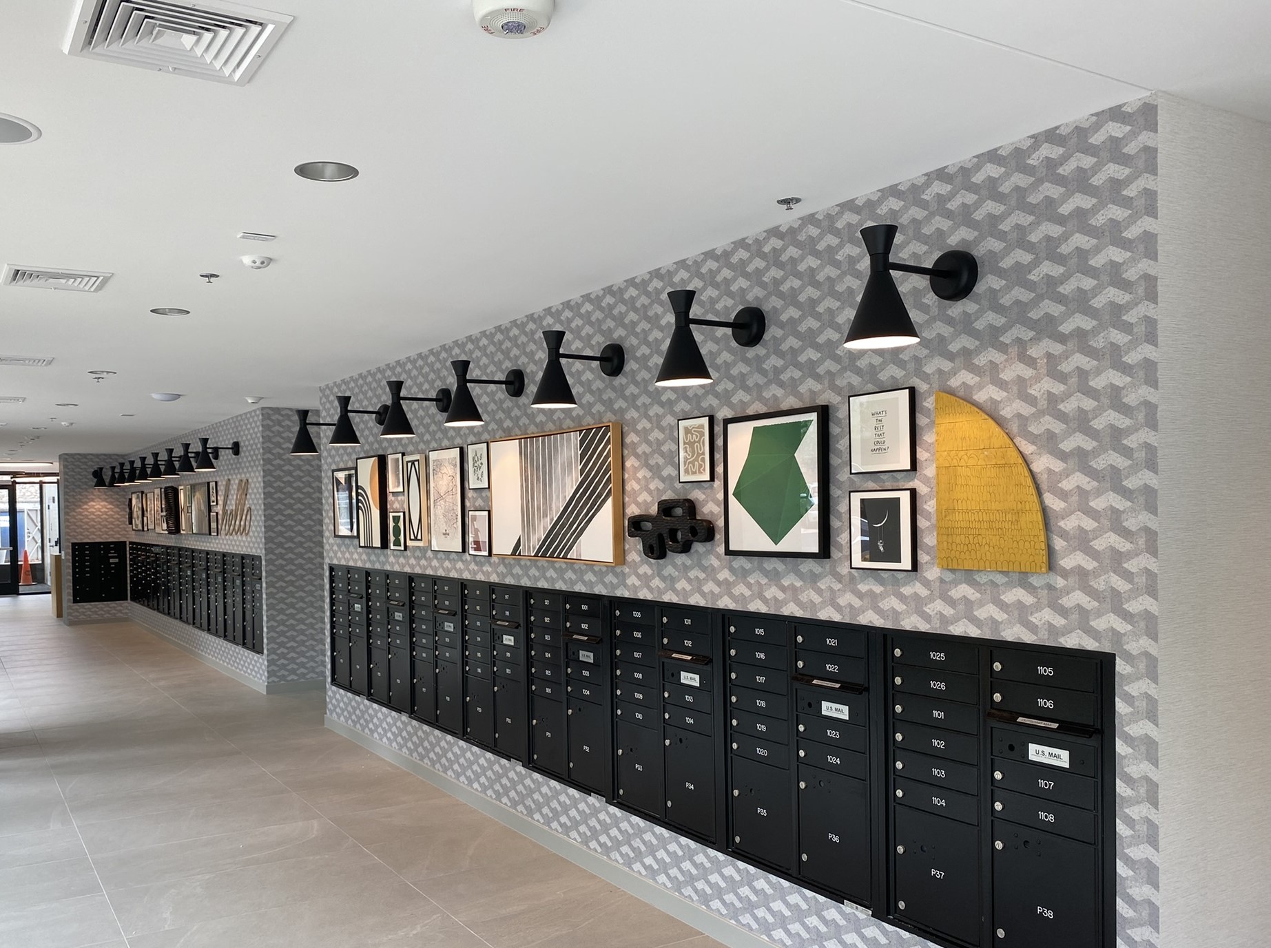
When most people think about art, they think about what sits inside the frame. However, custom framing is an art form in itself! Every choice that you make, from the mat to the size of the frame, impacts the final look of the piece. One of the most significant parts of custom framing is color. The color you choose for your frame and mat can enhance, complement, or contrast with the artwork or photograph to help bring out specific details. In this blog, we’ll explore the role of color in custom framing.
Color Impacts the Way We Perceive Things
Color has a powerful effect on mood and perception, which is why businesses invest so much time and effort into choosing colors for their logos and branding. When framing a piece, the color you choose can either blend seamlessly with the artwork, making it feel like an extension of the piece, or serve as a contrasting element, drawing the viewer’s attention to specific areas.
When you are completing your custom framing project, it’s a great idea to work with professionals who understand color theory to help you achieve your desired effect. Warm colors like reds and yellows can add energy and vibrancy, while cool colors like blues and greens can create a sense of calm and relaxation.
Coordinating the Mat and the Artwork
One of the ways you can incorporate color into your custom framing project is the mat, which serves as a border between the artwork and the frame. The color of the mat plays a crucial role in enhancing the overall look of the piece. A well-chosen mat color can bring out specific tones within the artwork.
For example, a neutral mat, like white or gray, is often used to provide a clean and classic look that won’t overpower artwork. Neutral tones work particularly well for photographs and minimalist art. On the other hand, colored mats can be used to make certain tones in a painting pop.
Coordinating the Frame and the Artwork
The frame is another place where color comes into play. While wood and metal are classic options that complement a wide range of artwork, custom framing gives you the chance to be creative. Choosing a frame color that coordinates with the dominant colors in the artwork can create a sense of continuity and make the frame feel like an extension of the piece itself.
For example, if the painting you’re framing has a lot of green, a frame with a deep green tint or even a natural wood frame with green undertones could blend well with it. Alternatively, a metallic frame could add a touch of elegance and contrast beautifully with the same colors. We can help you ensure that your frame color choice doesn’t compete with the art itself.
The Chessler Company Can Transform Your Business
At The Chessler Company, we work with interior designers, senior living, healthcare, multifamily property owners, and other businesses throughout the Mid-Atlantic region to create cohesive, memorable artwork experiences. Whether you need assistance with selecting artwork, framing it, or installing it, we are proud to be your one-stop shop for all of your art needs. Since 1959, our family-owned and operated company has been helping families like yours make memories last forever. To learn more about our framing services, call us at (410) 358-5161, and let us help you decorate your space!