
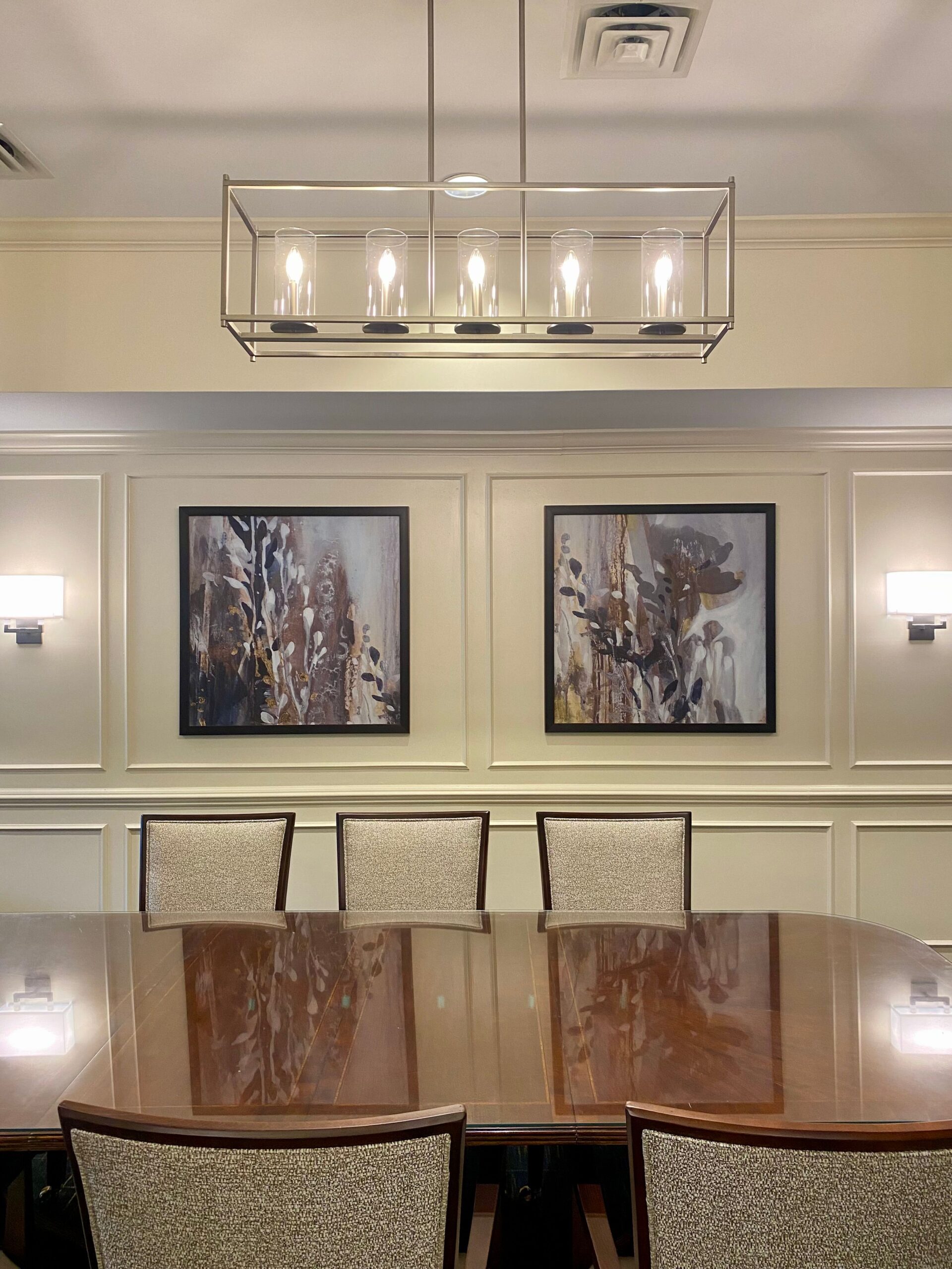
Every detail at your business plays a role in shaping the environment, including the frames that house your artwork or signage. Custom framing can subtly reinforce your company’s image and elevate the look and feel of your space. One key decision in the custom framing process is choosing the best frame color. Here are some of our top tips for choosing the best frame color to complement your commercial interior design.
Align with Your Brand Identity
In business settings, visual consistency matters. Your picture frames should not only complement the art in them but also align with your brand’s identity. If branding includes specific colors, those hues can be subtly reflected in your frame choices. For example, a law firm might lean toward rich wood or black frames for a classic, trustworthy appearance. However, a retail business with a red and blue logo might prefer minimalist frames in those colors. Choosing the best frame color can be a subtle but effective way to reinforce your branding.
Coordinate with Your Interior Design Style
You should also consider the overall style of your space when selecting frame colors. A luxury hotel may use gold or brushed bronze frames to add warmth and sophistication, while a medical or dental office might lean toward clean white or silver frames that create a sense of cleanliness. In a corporate boardroom, black or espresso frames can communicate formality and professionalism. Choosing the best frame color to match your interior design can create a more cohesive environment.
Think About the Lighting
Lighting plays a significant role in how frame colors appear. In commercial spaces with bright overhead lighting or natural light, frames with reflective finishes may have glare. However, matte finishes in the same space will look great and not be a distraction. When choosing the best frame color, think about how the frame will look throughout the day in your space’s specific lighting. A frame that looks great under showroom lights may appear too harsh or too dark in a softly lit hallway or reception area.
Don’t Be Afraid to Experiment with Matting
Matting can be a great way to bridge the gap between your artwork and the frame. A white or neutral mat can soften the look of a bold frame or add contrast. When choosing the best frame color, don’t forget to factor in how the mat will interact with both the artwork and the surrounding space. We can help walk you through a variety of mat options to find the right one for your artwork and its frame.
Work with the Professionals
Custom framing can be complicated, but you don’t have to do it alone. A professional custom framer can help assess your space, review your artwork, and recommend frame colors and styles that are a great fit. From large-scale corporate art installations to simple framed photography for your lobby, choosing the best frame color becomes much easier with expert guidance and access to quality materials.
Choose The Chessler Company for Your Custom Framing Needs
At The Chessler Company, we work with interior designers, multi-family property owners, healthcare facilities, corporate offices, and other businesses throughout the Mid-Atlantic region to create cohesive, memorable artwork experiences. Whether you need assistance with selecting artwork, framing it, or installing it, we are proud to be your one-stop shop for all of your art needs. Since 1959, our family-owned and operated company has been helping families like yours make memories last forever. To learn more about our framing services, call us at (410) 358-5161, and let us help you decorate your space!